11 Ways to Generate More Leads With Your Contact Form

Did you know that the average small business website conversion rate is 13 percent?
Granted, that incorporates all sorts of industries, from at home services to ‘mom and pop’ shops to catering…
We’ve worked with caterers for a long time, learning the ins and outs of how to create websites for caterers that convert visitors into real leads. It involved a whole lot of trial and error, A/B testing and experimentation, but we’re happy to say that we’ve seen trackable website leads of up to 22% with our caterers’ websites.
And that number does not include the phone calls or emails generated from potential clients finding and loving what they see online!
Since then, we have narrowed down some of our experiments, found ways to really measure website ROI and can now share with you just what to do to get a contact form that really converts visitors into leads.
Here are our 11 best tips on how to increase contact form conversion rates:
1. Limit the Number of Fields
We’re not talking just required fields; we’re talking all fields in general. Limit them! Imagine you’re going to a new website for the first time simply to inquire about services. Would you be more or less likely to fill out a contact form when, at first glance, there are 15 empty fields that would require your information? Eeeek. Probably much, much less likely.
Studies have shown that in general, the fewer fields you require, the more likely someone is to fill out your form and submit it. Do you really need 15 different pieces of information to get the conversation started? The answer is almost always, “No.”
Go for the basics, and if you can limit the required fields to under five (5), then you are in great shape.

2. Indicate Required Fields
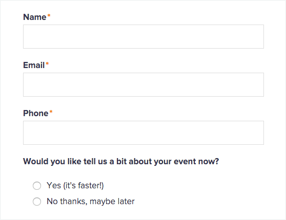
Not all of your fields might be required, and this especially goes for the phone number. Provide an asterisk next to the fields that are required, such as name, email address and reason for contacting.
Clearly indicating your required fields will increase the odds that visitors will successfully submit a query on the first try. On the flip-side, a failed submission will increase the likelihood that the visitor will leave your site without giving you any information.
3. Optimize Your Design
These design tricks have been tested, and the best results consistently came with the below page layouts. When designing your page, make sure that you adhere to these three contact page designs elements:
- Align all fields at the top of the page.
- Align all fields to the left of the page.
- Always use one column of fields.
Some forms try to get fancy by putting the field information on the bottom or aligning the form to the right of the page. That has proven more confusing for visitors and confusion results in an extra barrier to entry.
Any barrier to submitting a contact form will decrease conversions.
4. Create Trust
Essentially, a contact form is asking the visitor to enter his or her own personal information and submit it to you – a stranger. That’s pretty bold.
Make your contact page as trustworthy as you can by doing these three things:
- Only ask for information that is absolutely necessary. You can always get the rest of the information you need (say, a phone number) after you have established a relationship.
- Let the visitor know exactly what information you need and why you need it – i.e., what are you going to do with it? This is personal information, which can be sensitive to give out – it shouldn’t be a secret that you’re going to contact them via email or phone in however long it will take you to do so.
- Prominently display your privacy policy, which should state what your privacy policy is (which should always include never selling or using the visitor’s information for anything other than exactly what he/she signed up for).
5. Design for Mobile
Actually, instead of making your mobile design after you’ve created your desktop/laptop version, you might want to design your contact form for mobile first.
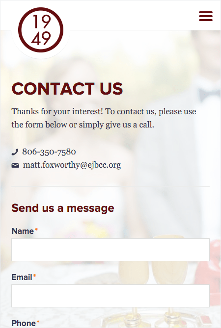
Studies have shown that mobile search and mobile visits are on the sharp rise and with contact forms being notoriously more difficult to submit via a mobile device, we don’t know why more companies don’t take this spike in numbers seriously.
Design your contact form for mobile first and foremost so that you can be sure that each additional field that a visitor must fill out doesn’t make him or her want to leave the site before completing the form.

6. Incentivize Your Visitors
Using the appropriate copy to entice visitors to submit a contact form is important. You should try to sell your contact form (or your email sign up) just as you would try to sell anything else: by providing an incentive.
What’s in it for them? Are they joining the 10,000 other caterers who receive this really specific, made-for-you information every month, or the 5,000 other people who have contacted you through your website for your services so far this year?
Numbers are a great way to demonstrate social proof; don’t be shy about ‘em!
7. Make a Promise
How long will it take for you to contact this person back? 24 hours? 48 business hours? Make a promise (then keep it!), and in that promise, let him/her know what you will be doing to address his/her concern specifically.
For example: Say Beth contacted ABC Catering about catering her wedding reception.
ABC Catering includes this on its contact form: Once you have provided ABC Catering with your contact information, our fabulous Head Wedding Planner, Jeanette, will email you within two business days to ask about your dream wedding so that we can put together an amazing menu.
Also, if you are asking for the visitor’s email and phone number, ask him/her what is the preferred method of contact, phone or email? That might also dictate how soon you can get back to them.
8. Be Unique
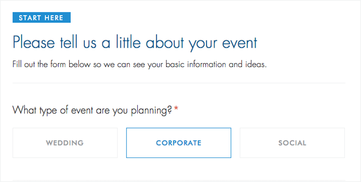
For example, have you ever done a mad lib? They’re pretty fun, we agree. Plus, you can get away with having a few more fields when the visitor is enjoying himself or herself while filling it out.
Typeform can help you create beautiful forms in a flash.
9. Don’t Say “Submit”
This is not a high school homework assignment to submit to the teacher. This is personal contact information. Way different.
At the very bottom of your contact form, you have a load of options to get the visitor to make the final, official step to “submitting” personal information to you. The thing about it is, however, the word “submit” is not super inviting. In fact, several A/B testing scenarios have shown that “submit” was one of the lowest performing words to get people to pull the trigger, so to speak.
The key is to make the copy reflect the action your potential client is taking. For example, try to entice visitors to make that final click with an incentive, for example, “Begin My Planning” or “Share My Story.”
10. Sell It with Your Headline
A page title that reads, “Contact Form” or “Contact Us” is majorly boring. It does nothing to excite the visitor. Encourage him/her to fill out the form by offering a reward for doing so right there in the title, such as “Sign up for monthly recipes” or “Yes, I want to start planning my event!”
In both cases, the visitor gets something for filling out the form: monthly recipes or a jumpstart on planning his/her awesome event.

11. Test, Iterate and Repeat
Test, test and retest your contact form. What works for one small business caterer might not work in the same way for another. These previous 10 tips are excellent starting points for you to go crazy on your contact page. Find out what works for you and test it until your contact page submissions have grown through the roof!
What’s a good indication that your contact form and page has been optimized?
Depending on what your website conversions were before you started testing different designs, field requirements, layouts, action words, etc., a good indication would be a 5 to 10 percent increase in submissions. Look out for a plateau in your growth, because that means you’re probably getting pretty close to an optimized contact page.
If your conversion rate is 8%+, that is a good indicator that your website is pretty well optimized!
More Articles You Might Like:


