37 Awesome Catering Websites

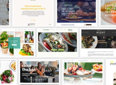
We looked at over 500 catering companies to answer the question:
What do the best catering websites have in common?
We looked at web design. We looked at technology. We looked at business strategy.
And we created this ever-growing list of awesome catering websites (currently at 37!).
If you want to upgrade your website in 2020, you’ll love the examples in this post.
Two things before you jump in:
- Think we should add a site? Send us an email to suggest your favorite.
- Websites that we designed are marked with “Nuphoriq.”
Without further ado, here’s our list:
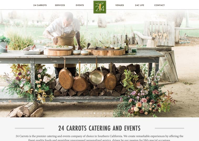
24 Carrots Catering and Events
Costa Mesa, CA
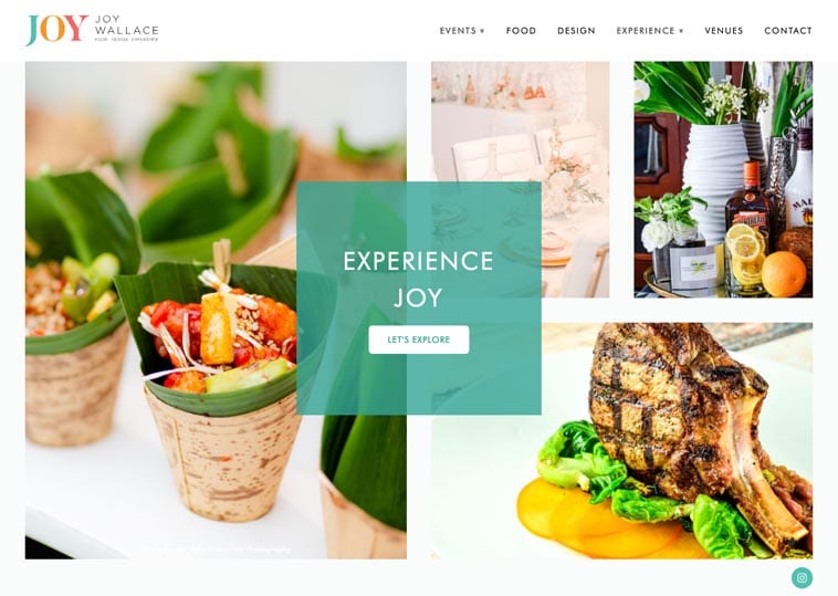
A Joy Wallace
Miami, FL
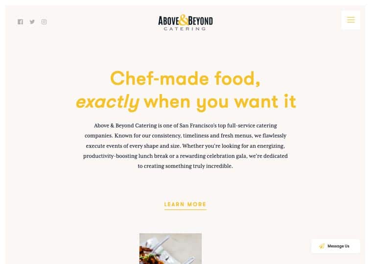
Above & Beyond Catering
San Francisco, CA
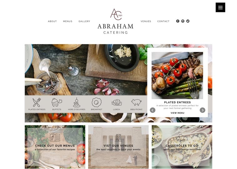
Abraham Catering
Omaha, NE
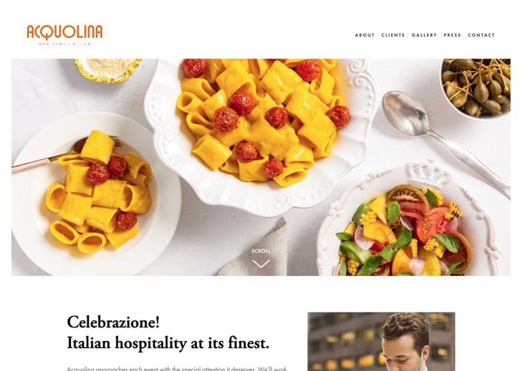
Acquolina Catering
New York, NY
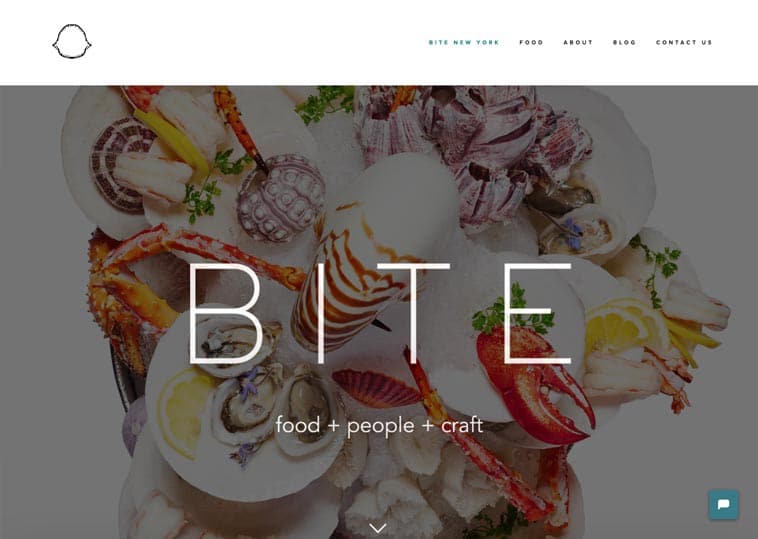
BITE
New York, NY
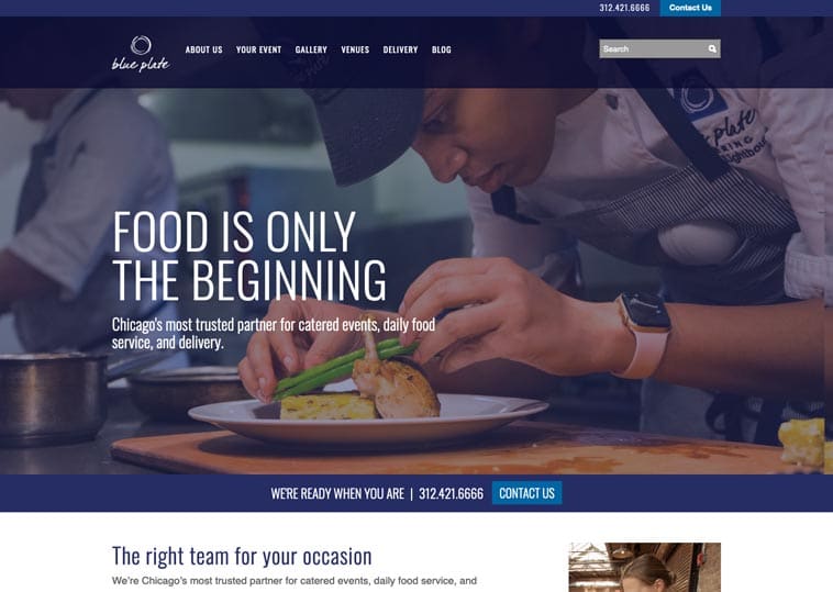
Blue Plate
Chicago, IL
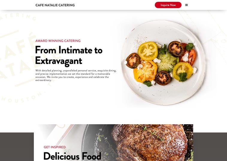
Cafe Natalie Catering
Houston, TX
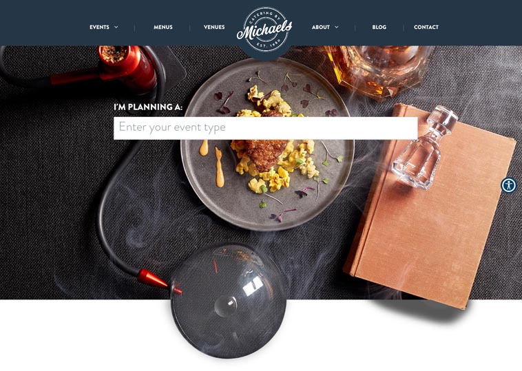
Catering by Michaels
Chicago, IL
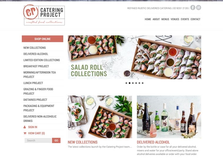
Catering Project
Sydney, Australia
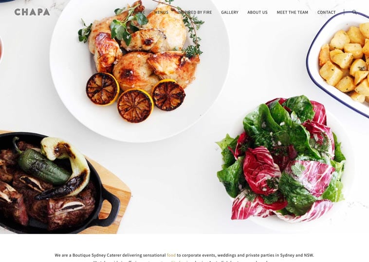
CHAPA
Sydney, Australia
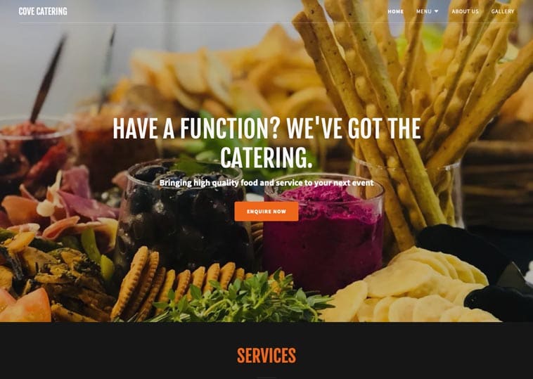
Cove Catering
Brisbane, Australia
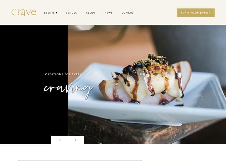
Crave Catering
Austin, TX
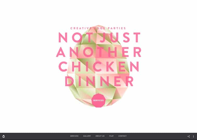
Creative Edge Parties
New York, NY
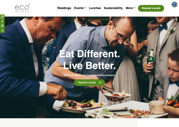
Eco Caters
Los Angeles, CA
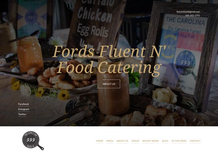
Fords Fluent ‘n Food Catering
Raleigh, NC
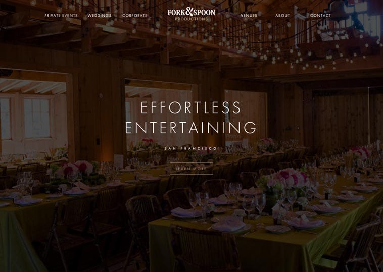
Fork & Spoon Productions
San Francisco, CA
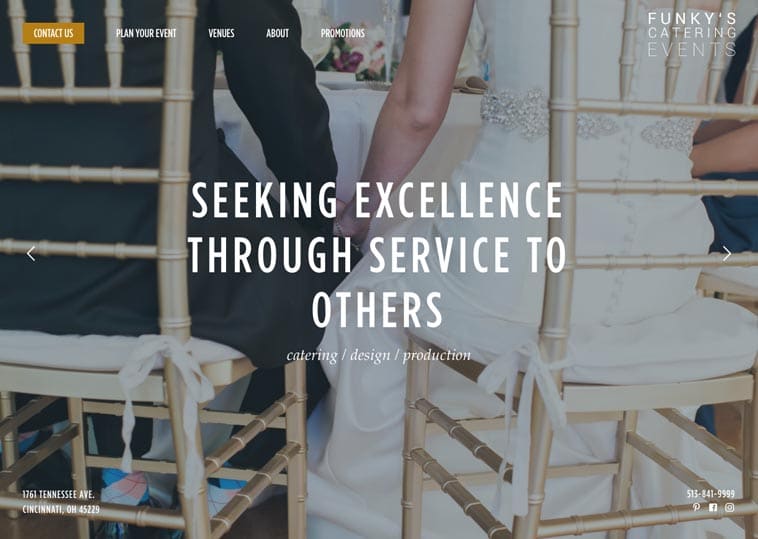
Funky’s Catering Events
Cincinnati, OH
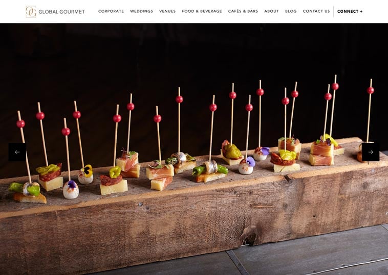
Global Gourmet
San Francisco, CA
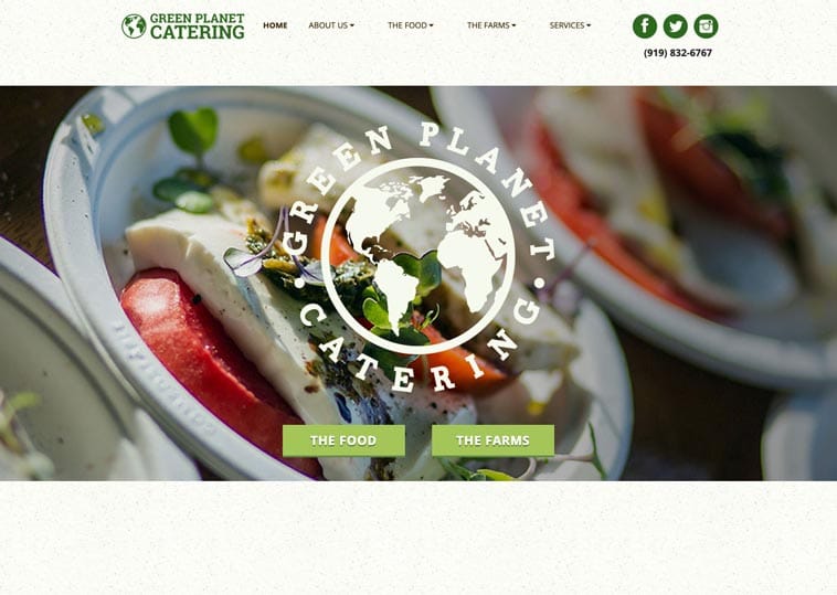
Green Planet Catering
Raleigh, NC
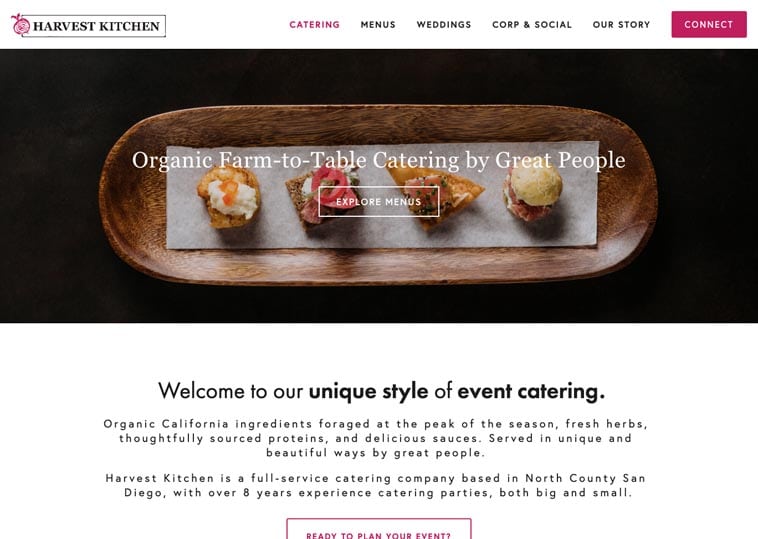
Harvest Kitchen
Vista, CA
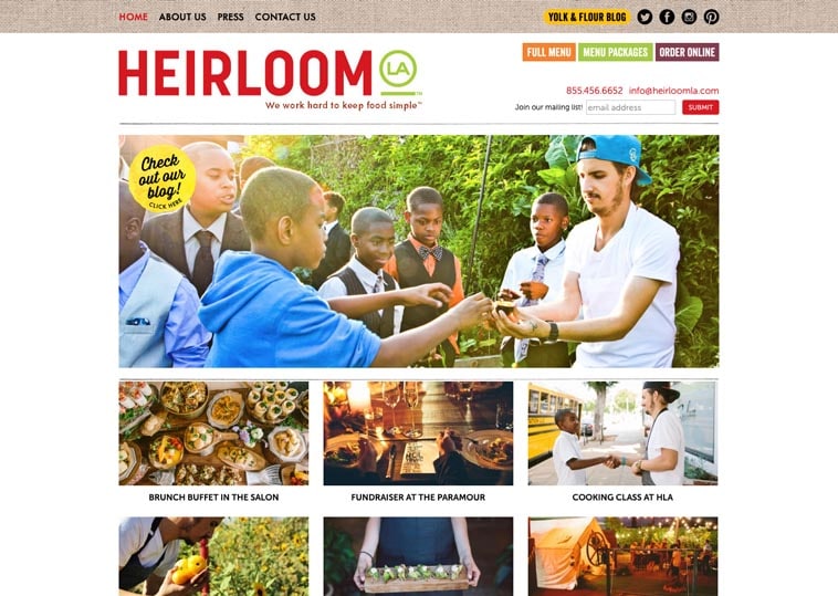
Heirloom LA
Los Angeles, CA
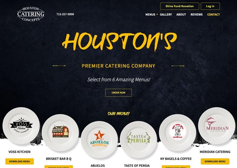
Houston Catering Concepts
Houston, TX
Joels Catering & Special Events
New Orleans, LA
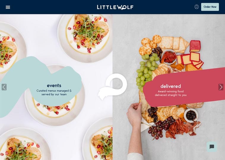
Little Wolf Catering
Auckland, New Zealand
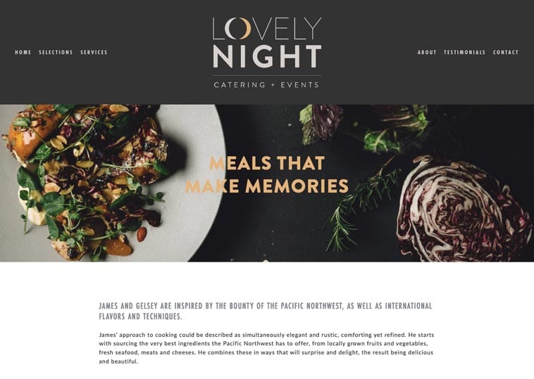
Lovely Night Catering + Events
Seattle, WA
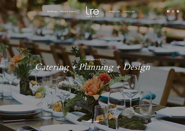
LRE Catering
San Francisco, CA
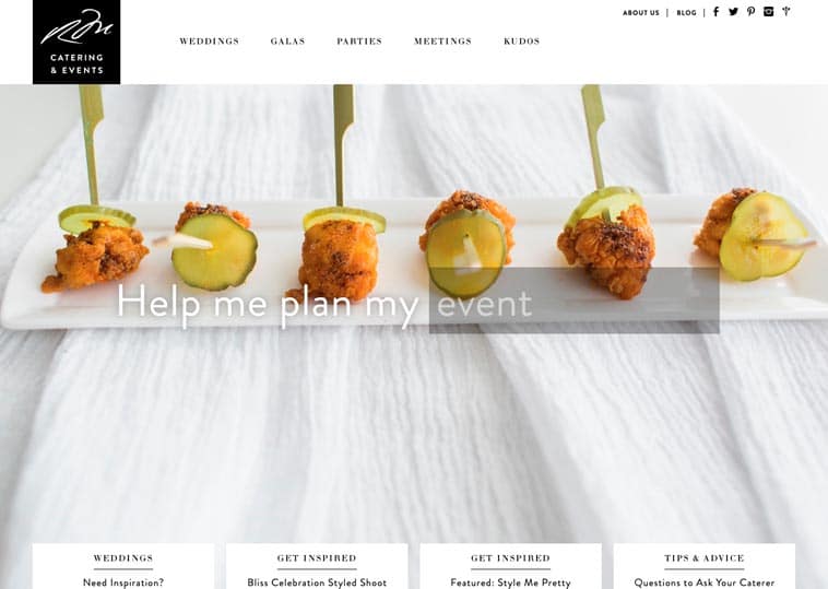
Morins Catering & Events
Attleboro, MA
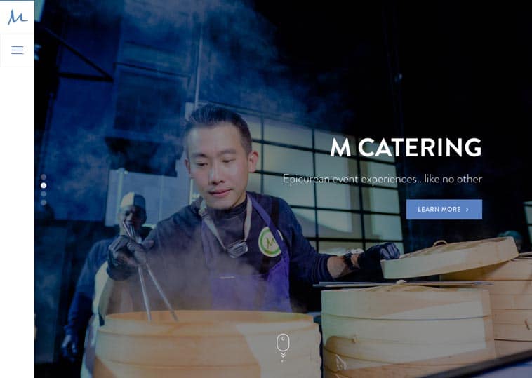
M Culinary Concepts
Phoenix, AZ
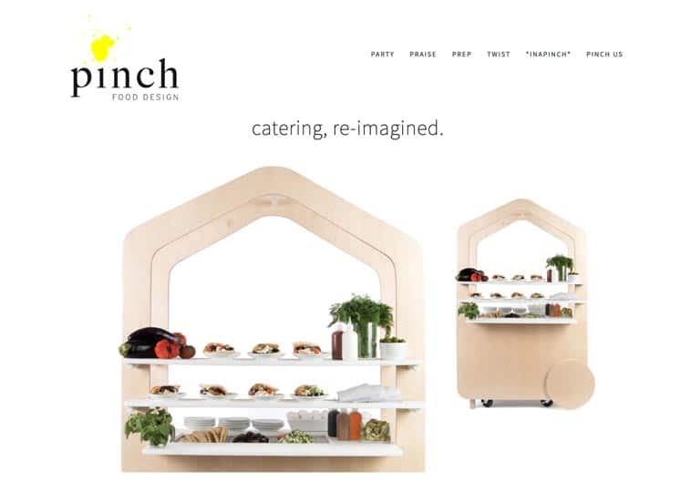
Pinch Food Design
New York, NY
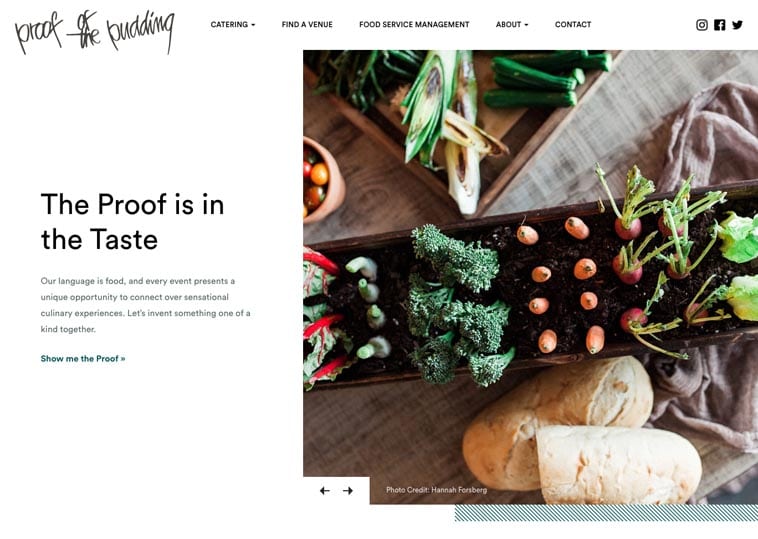
Proof of the Pudding
Atlanta, GA
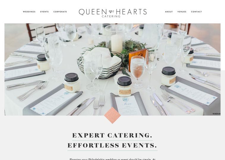
Queen of Hearts Catering
Malvern, PA
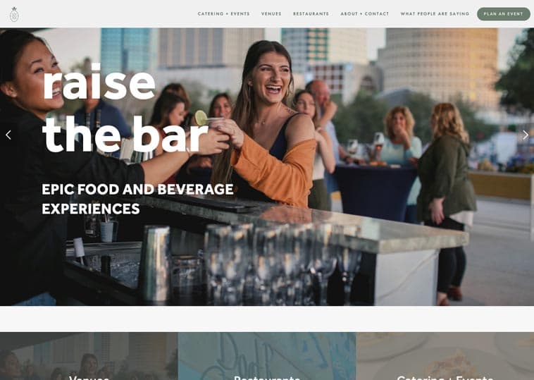
Salt Block Hospitality
Tampa, FL
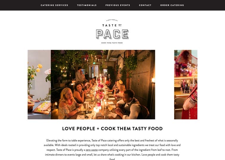
Taste of Pace
Los Angeles, CA
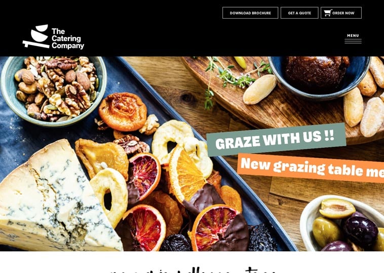
The Catering Company
Melbourne, Australia
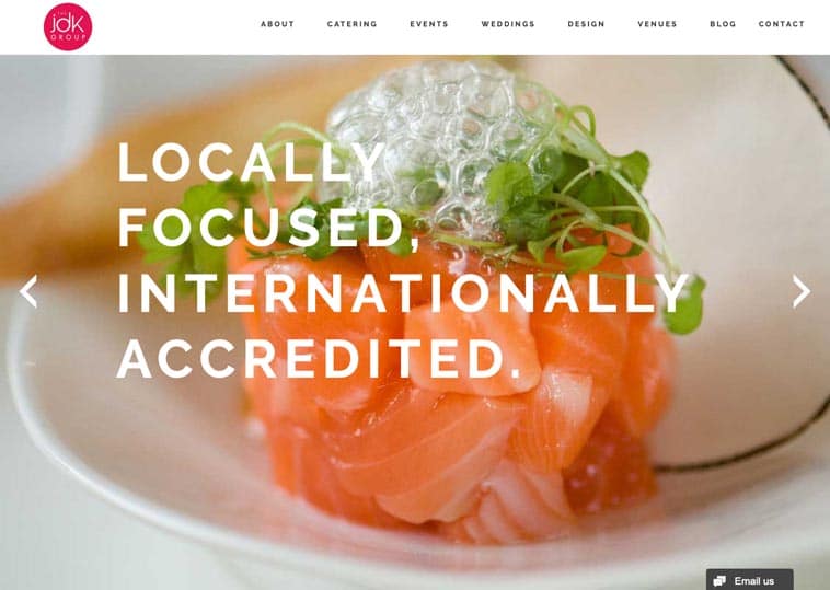
The JDK Group
Camp Hill, PA
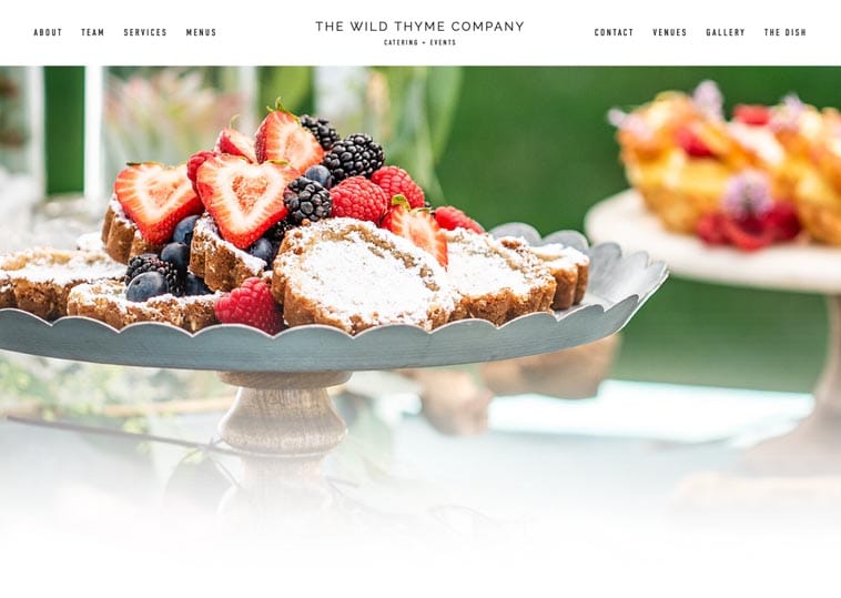
The Wild Thyme Company
San Diego, CA
So, what do the best catering websites have in common?
What stands out when you compare your website to the sites on this list?
Maybe your website’s design feels dated or it’s not mobile-optimized. Maybe your site is hard to update, has bad SEO or doesn’t generate enough leads.
Whatever your challenges and goals, the principles of a great catering website remain the same:
1) Accessibility
Website accessibility will be a huge trend for catering websites in 2020.
First, let’s define it:
Website accessibility is the practice of making web content accessible to people with disabilities.
As a caterer, you are required to have an accessible website under Title III of the Americans with Disabilities Act (ADA).
Here’s why:
The ADA is a civil rights law prohibiting discrimination on the basis of disability in the activities of places of public entities.
And as a catering business, your website likely qualifies as a public entity. This allows the legal system to hear cases brought by people with disabilities who find themselves unable to use it.
Put simply, you can get sued. It’s unlikely but possible.
It gets trickier:
For most public entities, like parks and schools, there are clear accessibility standards to follow, e.g., “Make hallways 15 feet wide.”
But legal standards have yet to be developed for websites.
So what can you do?
As of early 2020, the most accepted standards for website accessibility are called the Web Content Accessibility Guidelines (WCAG). The WCAG provide instructions for coding an accessible website.
To make your website accessible, it must be coded per the WCAG.
Unfortunately, there’s no quick way to check your website’s accessibility—it’s almost all hidden in the code!
Your best bet is to ask your web developer or platform provider. You can also send us an email; we’d be happy to check for you.
One final note:
We’re proud to say that all Nuphoriq websites meet the WCAG*. We (specifically Benjamin) have spent 100s of hours perfecting our code to make this possible.
*As legal standards don’t exist, a lawyer is ultimately required to 100% prove accessibility.
2) Clarity
Website clarity means having just the right amount of information, organized logically.
I’m always tempted to over-populate catering websites.
Every caterer is different; the menus, workflows and details require explanation!
But on the other hand, too much information causes visitors to lose interest.
And information is often at odds with design. Pictures are prettier than paragraphs.
That’s why clarity is key.
If you have the right amount of information in the right spot, visitors will be happy. After all, people are on your website to learn about your company.
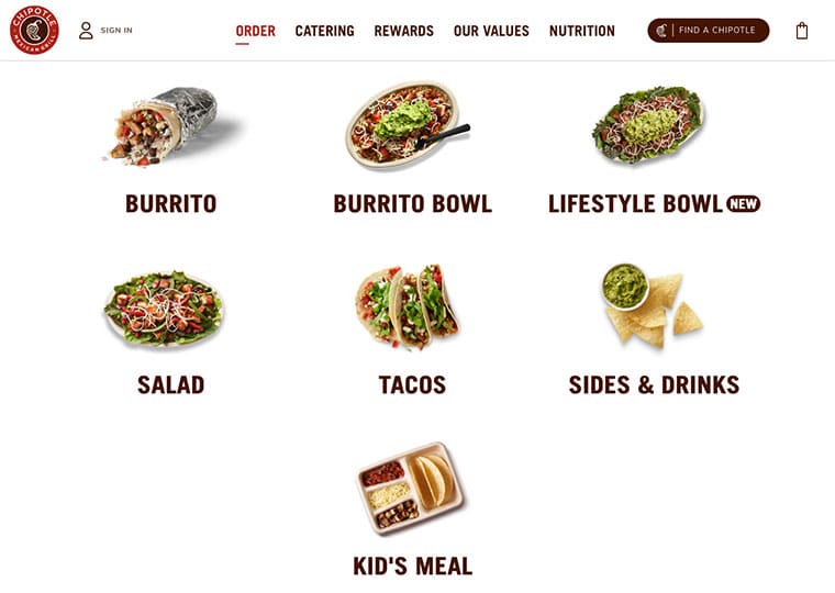
Chipotle is my favorite example of clarity.
They’ve simplified a multi-step, always-custom ordering process into a single line and a few pictures. You don’t even need to be literate to understand how it works!
That’s the experience you want to create on your website.
In the catering world, Proof of the Pudding is a great example of website clarity. Proof is a complex caterer that 3 off-prem services, food service management, pop-up shops and has a bunch of exclusive venues.
Yet their home page has only ~600 words. What’s more: you immediately understand their offerings and can navigate to any service in one click.
That’s the essence of website clarity.
3) Authenticity
The top catering websites are always authentic.
I know that sounds woo-y. It’s difficult to put authenticity into words.
Let’s try anyway:
An authentic website is designed to express what makes your company unique.
Your core message. The fabric of your company that’s woven into everything you do.
Beyond design, an authentic site expresses your uniqueness by way of content, clarity and organization.
An authentic website feels like talking to you on the phone, like being at your events and like working in your kitchen.
Check out the Catering Project , Joels and Pinch websites.
Notice: Each looks different. Has different pages. Catering Project even looks like it was designed 10 years ago; it doesn’t matter!
They are each authentic: built around the brand’s core message.
And for that reason, I’d bet they are extremely effective at converting visitors into leads.
4) Design
There’s a store called Fox Trot down the street from my apartment in Chicago.
In three years, Fox Trot opened its first location, opened 11 more locations and launched a mobile app.
Fox Trot is a convenience store. They sell candy bars, drinks and coffee just like 7-Eleven, Kum and Go and Casey’s.
How did Fox Trot come to dominate an established market in a major city in just three years?
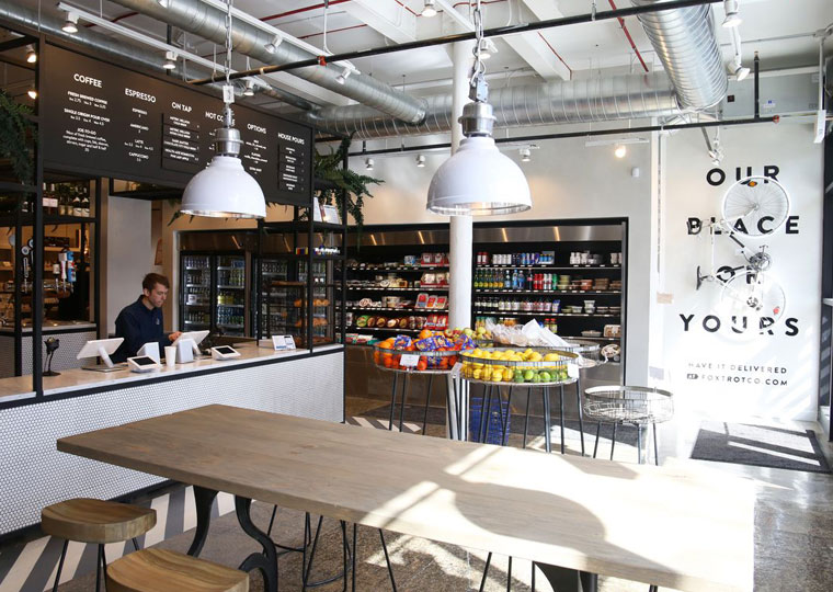
Yes—design! Fox Trot is just plain pretty. The logo, interior design, signage, website, app, everything is consistent, professional and hyper-targeted towards the millennial Chicago market.
In 2020, every small business, caterers included, should have incredible design. If you don’t invest in design, your business is susceptible to any company that does.
In summary:
Great design is the foundation of a great catering website.
5) Speed
The best catering websites load fast.
Speed matters for two reasons:
- For every extra second your site takes to load, you lose 10% of visitors (reported by the BBC).
- Google has outright said that fast websites have better SEO.
There are three primary factors that influence site speed:
- Code quality. In website code, one function, e.g., a popup window, can be accomplished in infinite ways. Some ways use three lines of code, some 3,000. Less code = faster load.
- Image file size. Image format (e.g., JPEG vs. PNG) and dimensions (e.g., 3000px vs. 30px) determine the file size. Smaller images = faster load.
- Hosting. Put simply, some hosting services are faster than others. Yes, GoDaddy is cheap, but you kinda get what you pay for. We host all our clients’ websites on Flywheel—a hosting company that’s built for security and speed.
So all said, faster is better.
Check out the Google Site Speed test for our client, Crave Catering. Enter your website’s URL to compare your site!
6) Updatability
Updatability refers to your ability to update your own website.
This is more a personal philosophy than something we could test when creating our list.
But it’s an essential part of every catering website.
In short, you should be in control your own website.
Menus frequently change. Team members change (hopefully not too frequently). Events happen every day.
The more up to date your website, the more effective it will be at driving leads.
And it’s far easier (and more affordable) to make updates yourself instead of paying web developers.
Now What?
Great catering websites do two things:
Get traffic. And turn traffic into leads.
Did we miss your site? Send us an email and we’ll add it to the list (if it makes the cut ;)).
And check back soon! We continuously update our list as we find new sites.
Updated: January 2020


