10 Examples of Mobile-Friendly Catering Websites

If your site isn’t mobile-friendly, it’s time to upgrade!
For mobile-friendly website examples, check out our list of the best catering websites.
But first, let’s talk about why mobile matters!
Across the globe, 60 percent of all online traffic happens on a mobile or tablet device, and that number continues to grow. Additionally, mobile search accounts for over one-fourth of all search traffic.
In fact, a Google survey reports that 77 percent of mobile searches occur at home or at work — places where desktop computers are most likely available — which could mean that people are choosing to use their mobile devices over desktops and laptops.
Heck, even mobile email opens have grown by 180 percent over the last three years.
Here are some other mobile statistics that you should know:
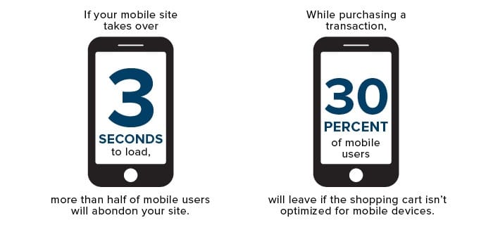
While that last bit of information may not apply to you as a caterer (unless you have an online ordering system), it certainly is a good indicator as to what consumers have come to expect as the norm.
Think about how little patience you have when you’re on your own mobile device — your customers have that little or less when it comes to you and your site!
We’ve done some research on our own; narrowing down results to catering websites throughout the U.S., and here’s what we’ve found*:
- 21 percent of all traffic is on a mobile device.
- 12 percent of all traffic comes through searching on a mobile device.
- 55 percent of all search traffic is through mobile search.
- The average time spent on a mobile catering site is 1 minute 26 seconds while the average time spent on a desktop catering website is 1 minute 51 seconds.
It’s very clear, and difficult to ignore:
Mobile search and mobile traffic for caterers are a HUGE deal!
What Does This Mean for YOU?
While this information is caterer-specific, it’s limited to a small pool of test subjects — about a dozen or so. You should see how you stack up. Your website, mobile-friendly design (hopefully…), content, SEO and region, et al., will certainly impact how you compare to this small test group.
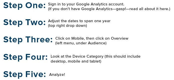
How can I check my mobile traffic?
A great question, because this is information you should know! Let us breakdown a very simple how-to process for you:
What Does Google Want in Mobile?
As if the above numbers weren’t enough to tell you how big mobile is, here it is, black-and-white, from the be-all, end-all of online search: Google.
Earlier this year, Google announced that beginning April 21, 2015 (which has come and gone people!):
“We will be expanding our use of mobile-friendliness as a ranking signal. This change will affect mobile searches in all languages worldwide and will have a significant impact in our search results.
Basically, Google says that if our websites are not mobile-friendly, our mobile search rankings will suffer the consequences.
While the algorithms will remain a mystery, we do know that Google is looking for:
- Design that makes navigation easy for visitors.
- Easy accessibility for visitors to complete common tasks.
- Mobile template, theme or design that is consistent throughout all mobile devices.
What Do Consumers Want in Mobile?
There are tons of statistics that lead us very useful conclusions about what consumers want when visiting mobile websites. For example:
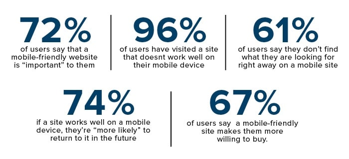
Let’s put this and Google’s information together, shall we?
Here’s what a mobile-friendly website should have, according to users, visitors, consumers, statistics and Google:
- Quick loading time (three to five seconds max!)
- Prominent hours of operations
- ‘Click to call’ feature
- Easy ‘contact us’ via email or contact form
- Prominent links to your social media pages
- Video (where appropriate)
- Big, mobile-friendly buttons
- Limited or no scrolling and pinching
- One-direction scrolling (vertical OR horizontal, not both!)
How Do Non-Mobile-Friendly Websites Compare?
On average, the mobile-friendly catering sites had higher percentages of total mobile visits and visits from mobile search than non-mobile-friendly catering websites*.
The biggest difference between mobile-friendly and non-, however, is the average time spent on mobile catering sites per visit*.
- On average, the time on page for mobile-friendly catering websites was nearly 15 percent greater than non-mobile-friendly sites.
You should know, also that these statistics span a full year, including time before Google introduced its “significant impact on search results” for non-mobile-friendly sites.
We’d venture to guess that in a few months time, the discrepancies between mobile-friendly and non-mobile-friendly time on-site and search visits will be even more drastic!
Is YOUR Site Mobile-Friendly?
Great question, especially after we’ve thrown all of this impossible-to-ignore information your way.
You checked your mobile traffic, understand how critical mobile devices are and will continue to be into the future and now want to make sure that your site will not suffer the Google penalties and consequences for a non-mobile-friendly website.
Thankfully, Google has created this tool that simply tells you “yes, you’re mobile-friendly” or “no, you’re not mobile-friendly.”
If you’re not mobile-friendly, as this Google tool might indicate, then you might want to consider a plan that will turn your site mobile-friendly.
If you are mobile-friendly, then perhaps you might consider allocating your efforts toward increasing traffic and investing in SEO through content plans, more active social media, better-targeted pages, etc., as we believe mobile search is only going to grow. Capture some of that new traffic!
Again, you can’t argue with statistics. People are mobile, and it’s only the beginning.
*Analyses and results are not comprehensive of all catering websites; rather they are indicative of a small pool of caterers varying in size, region, markets served, employee sizes, capabilities, etc. All data are indicative of one full year of analytics from Google Analytics.
Mobile-friendly website examples
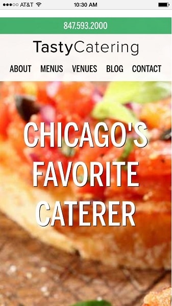
Tasty Catering
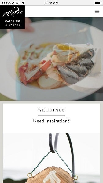
Russell Morin Catering & Events
24 Carrots Catering and Events
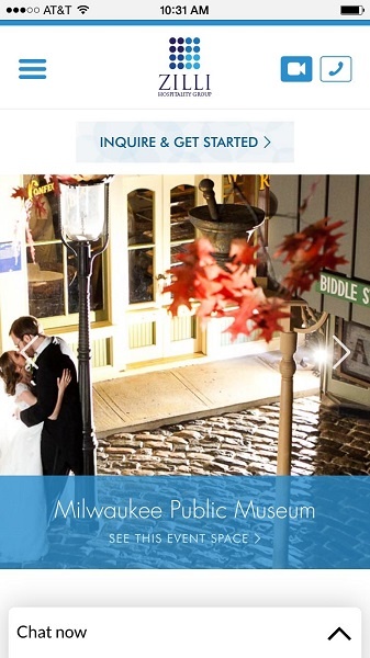
Zilli Hospitality Group
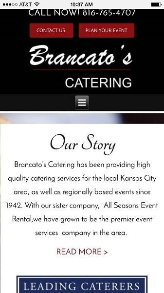
Brancato’s Catering
BG Events and Catering
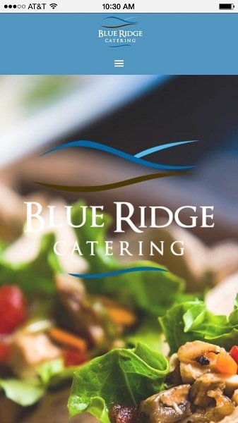
Blue Ridge Catering
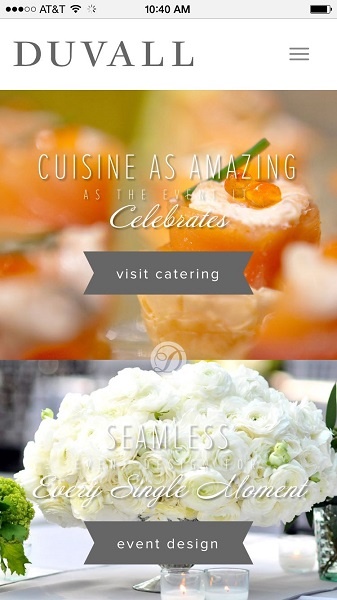
Duvall Catering & Event Design
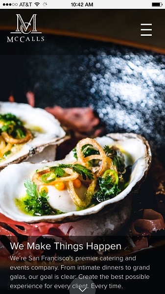
McCall’s Catering and Events
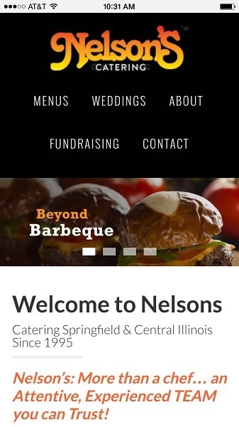
Nelson’s Catering
For even more examples, check out our list of the best catering websites—every single one is mobile friendly!

