10 Venue Website Must-Haves for Venues & Caterers

Let’s talk about what makes a venue website unique. Though it shares similar information and speaks to some of the same audiences as a catering website, there are some big differences. The main one being: while a catering website has room to stretch its wings across multiple pages and service areas, a venue website must provide an action-packed snapshot in a more contained space. Caterers want you to contact them, while venues literally want to invite you over. This distinction is key.
Caterers: Think about your exclusive venues, others you work with quite frequently and those with which you want to foster a stronger relationship. Are there any unique venues that would benefit from their own interactive platform? Venue owners: Are you painting the clearest, most direct picture of your venue’s strongest selling points?
There’s a good chance whoever has poked around your website has never stepped foot in the venue being described. It’s not enough to list the amenities and spaces and call it a day. They’re not paying for a room at a hotel—they’re paying for an experience that’s attached to their personal history or business goals. What pictures you choose and words you use to depict their experience matter. Here are a few ideas and must-haves for your venue website:
A touch of history
Phoenixville Foundry is an example of a venue website that has a deep connection to its history. Built in 1882, the building has undergone quite the innovative evolution and stands as a shining example of Philadelphia’s industrial roots. The design group that worked to revitalize the facility in 2006 envisioned “a flexible event space that melds the industrial character of the building with modern elements that add an elegant sophistication to the interior spaces.”
Every space has a story. Maybe in another life the venue was an old piano factory or a bakery. Maybe it’s surrounded by lush farm life or located in a neighborhood that is currently being revitalized. Maybe major parts of it were destroyed and since then renovated. Perhaps it houses documents or artifacts that have an important tie to the history of its surrounding community. Maybe Albert Einstein was there nearly 80 years ago. These are details couples, event planners and others want to know. Your interesting bits of history are a great speaking piece.
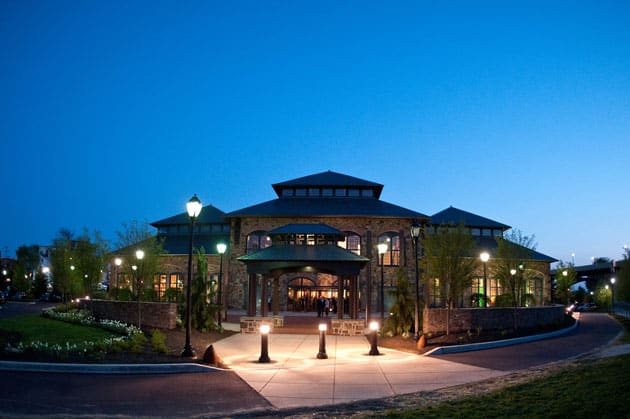
The Transept also has an interesting tale to tell. Once a German Gothic church, it has since been transformed into a standout Cincinnati venue and historic landmark. Visitors and wedding-goers alike have been awed by its stained-glass windows and rich, ornate details and enchanting atmosphere.
Meet the owners & onsite team
Though introducing the owners of a venue is not a requirement, it certainly adds a nice touch. Having a face attached to a venue is the first step to developing a relationship with a prospective client.
The Blue Dress Barn leads with the story of a couple. On its homepage is a picture of owners Amelia and Kirby Briskee, donning cowboy hats and holding hands in front of their wedding venue. Their story tells of two “visionaries, cutting-edge designers and fine artists who met in Chicago where they were both influenced by the city’s art and culture.” I don’t know about you, but for me—instant connection! This kind of information would resonate with a couple who is looking to tell their own wedding story.
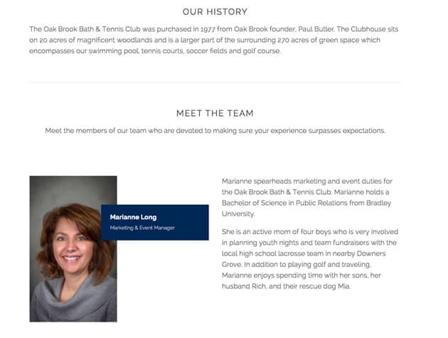
In Oak Brook Bath & Tennis Club’s About section, we meet Marianne Long, the marketing and event manager responsible for creating a 5-star experience for couples throughout the Chicagoland suburbs. It turns out she’s also a mom of four boys and has a rescue dog named Mia. Again, these small but meaningful details add to the human element that goes beyond the walls of any facility.
Plus, weddings and other events are expensive, so you want people to know that your venue is worth the money because of the venue itself, yes, but also because of the trust you’re willing to establish with them from square one: your online presence.
The nitty gritty
When we say “nitty gritty” we mean amenities and all the details clients want to know about. What is the capacity? Is there a rain plan? Dressing quarters? Do you have a place where I can park my car and hang my coat? Are the tables included or do we need to rent them? Sweet, brand new farm tables! What does the dance floor look like? Is it big enough for the hustle or line dancing? In this section, it’s important to give people as much detail as possible and make it easy for them to understand.
Let’s go back to the rain plan though. Weather has been ruining weddings and events since the dawn of time. It’s a number one concern for a lot of people who want to have an outdoor event. That’s why it’s important to have your protocol down to a science. If you haven’t seen it already, check out the heavy-duty plan in place at Springton Manor Farm.
Virtual tour, a window to your world
Virtual tours rock! As marketing professionals who partner with catering companies and venue owners, they certainly help us desk jockeys get a feel for a space. Imagine what this does for a client! The Catered Affair employed a virtual tour for its exclusive venue, the Boston Public Library. With such an expansive location with a variety of spaces and oh so many intricate details, it’s oftentimes best to transport the client. P.S. if you decide to take the BPL tour, be sure to check out the stunning murals in the Chavannes Gallery.
Zilli Hospitality Group likes virtual tours, too. So much so that their venue finder has a virtual tour for almost all of the venues they work with.
Floor plans of every space
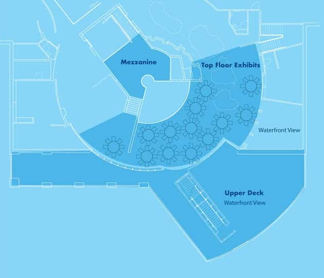
Floor plans are another excellent way to give clients a clearer understanding of a venue.
ECHO, Leahy Center for Lake Champlain is a leading non-profit organization serving Vermont, attracting event-goers and museum visitors alike. The interactive exhibits and multiple tiers of spaces provide a unique experience for fundraisers, weddings and important corporate events. Because it’s such a large, complex venue, its broken up by space. Every single space has a page dedicated to it, with a floor plan and pictures to showcase its capabilities.
Videos!
Video is one of those components of a website that are often well-worth the investment. They do what words and pictures can’t. And they sure know how to bring a testimonial to the next level.
Pecan Springs Ranch draws you in the second your eyes hit the home page. It was definitely a smart idea for this venue website to lean on video to showcase the 6,000 square-foot property complete with horses, a preserved 1800s-era log cabin (aka the Love Shack), quaint dressing quarters, 17 acres worth of gorgeous plants and pecan trees, a roomy patio and so many rustic details that are just oozing with romance.
Lots and lots of visuals
Visuals are everrrythinngg. There’s nothing like a wall of crisp, high-resolution photos depicting the settings and experiences people have yet to get a feel for. There’s a reason why Instagram’s layout works. Galleries give potential clients the chance to envision their big day or grand event.
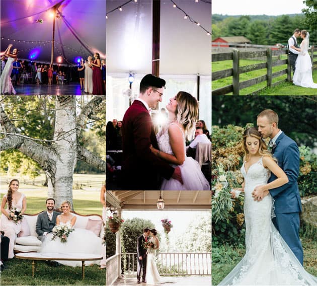
If anything, you’re giving people inspiration for questions like: what will my wedding look like at night? Does the venue provide any festive decorations in the winter? How can this room be turned into breakout spaces for my corporate event? It’s important to give people just enough so that they’ll come in for a tour.
Culinary partner showcase
Caterers have so much pressure to provide delicious food. Most people who work in this industry know all too well that catered food is expected to be just as good, if not better than, restaurant food. And everyone is a foodie these days! Just ask your typical Yelper.
This is why it’s essential to clarify on your website what your food options are. Many caterers discuss their exclusive venues and list out their preferred ones. We know that pain. You will always have to prove that you are a foodie in the same way that a caterer will always have to prove that they’re not only a restaurant, so to speak.
Eager calls to action
It’s not, “call me,” it’s “come see me!” Let them know that they just have to see your venue for themselves. Nearly half of the venue owners we speak to simply need people to come in. Let them know that they will fall in love with the space.
At the end of the day we all know that getting people to see, feel and experience the space is what sells. The more people in the door, the more bookings. Encourage people to connect with call to actions throughout the site. One of the strongest calls to action is “schedule a tour.”
Galleria Marchetti uses the prompt: Like everything so far? Wait till you see for yourself! And there are one or two actions to take: explore space and book a tour.
See how Pinecroft uses “schedule tour” in both the header and footer. Very impactful.
Booking calendar or pricing page
This part is completely optional! But depending on the demand for your venue and sales process you may want to consider a booking calendar or pricing page. There are pros and cons to each.
A pro is that it helps you qualify people right off the bat, and it rules out those with a dead set date.
A con would be that it lessens your sales team’s ability to sell and negotiate.
It’s all about providing a user-friendly experience, yeah? How do you really tell people your venue is the bee’s knees? And if you’re a caterer with 70 venues under your belt, how do you help people navigate through them and decide which is the best fit? In the end, a clearly constructed venue website with lots of visuals, important details, a story to connect with and eager calls to action is what will bring people in.
We hope this gives you a lot of ideas for your venue or the venue partners you work with. If you have any questions about anything we talked about here or questions that relate to your venue, we’d love to hear about it. Reach out today!
More articles you might enjoy:


